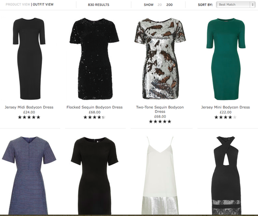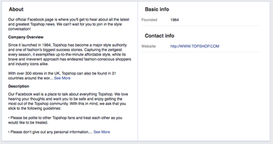
The website is laid out simply but effectively, this is appropriate for the brand as their mission statement declares that they ‘target everyone that loves fashion, regardless of age or income’ (Topshop.com, 2014). Although, the retailer primarily focus on women aged 15-30. At the top of the page, there are 8 options to view different products such as “clothing” or “shoes”, then a drop down menu appears when hovering over the button hotspot with further options to shop by trend or collection. This format remains the same on the Facebook page with a clear navigation panel including options such as “events” and an “about” section including a background to the retailer, this is also on the website. These functions are not accessible in store: being a reason many customers take to the internet to shop there. The website it highly saturated with different choices but the format used a white background with black writing makes the site look clean and concise. Other online retailers such as missguided contain many visuals on their website, lots of animations and flashing text: this is appropriate for the category of people they are wanting to target but due to Topshop aiming to capture the attention of the older, classier consumer their format is effective. This price point of Topshops garmets are also a reason the website is more sophisticated. However, Topshops Facebook page differs as it is vibrant and visual- for example the video clip of their New Years party collection. This is appropriate for Facebook as social media is particularly popular with the younger generation who would be more inclined to read the page if it was not content heavy. At first glance on the website there is an advertisement featuring this seasons novelty jumpers and located next to the visual there is a lookbook which showcases similar items and gives the option to shop that trend and view their winter gift guide. This structure is cohesive, grouping trends together making it easier for customers to be able to shop without having to few irrelevant products. Topshop showcase their products in an orderly fashion using the grid method with 4 items across each line with different options to view 20 items or 200 per page. The viewer is given the option to view the product or the full outfit which is an innovate creation which is not done by many other retailers. Within a category, there are subcategories: ie, within the dress category you are able to select to view midi dresses or shift dresses. This function makes shopping an easy and enjoyable experience and is an advantage of digital communication and modern technology. In addition to this there is the option to refine results even further, by size, fit and colour. With all this information available on the website, Topshop do a great job at structuring it with the use of roll overs and drop down menus ensuring that the screen is not over loaded and looks how it was originally designed. The Facebook page is also structured in grid format, using picture boxes and information in different sections about how many likes they have. Topshops design team have used different visual techniques on the site to interest the potential customers, such as the use of typography. Clearly on the home page is the offer of free delivery when spending over £50, featured in bold, drawing the customer to this and using it as an incentive to use their digital communication method over any other.